
Taco Bell

Role
Principle Product Designer
Agency
BASIC/DEPT®
Project engagement
Spring - Summer 2026
One brand had become multiple systems.
Taco Bell's digital ecosystem had evolved independently across markets, platforms, and teams. Over time, hundreds of small design decisions had created meaningful differences across one global brand experience.
The challenge wasn't introducing another design system. It was understanding how the existing systems had drifted apart, then creating a path to bring them back together without losing the energy and personality that makes Taco Bell unmistakably Taco Bell.
· Audit, Research, & Documentation
· Design Systems (Adapting & Maintaining)
· Figma Variables & Components
· Brand Direction
· Responsive & Adaptive Visual Design
· Inclusivity & Accessibility
Guiding principles
Consistency is a product decision.
Small inconsistencies become meaningful at scale, especially when millions of customers experience the same brand across platforms and markets.
Design systems are never truly finished.
A system stays useful through continuous auditing, documentation, and evolution as products, teams, and customer needs change.
Unification starts with understanding divergence.
Before bringing systems together, we first had to understand where they differed, why they evolved apart, and what deserved to move forward.
Project Success
Global Brands
Enterprise Design Systems
Existing Screens
+
The system didn't break. It drifted.
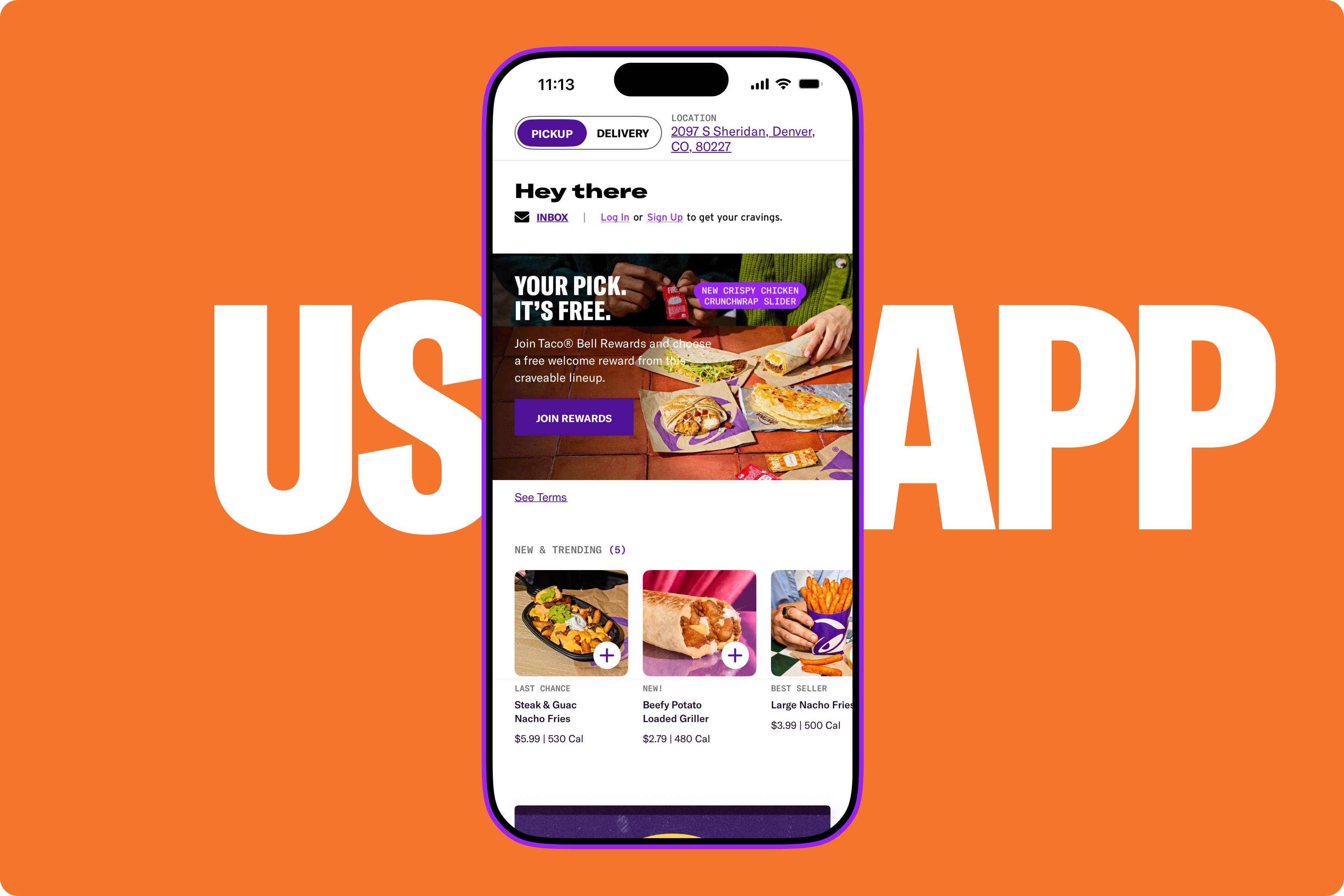
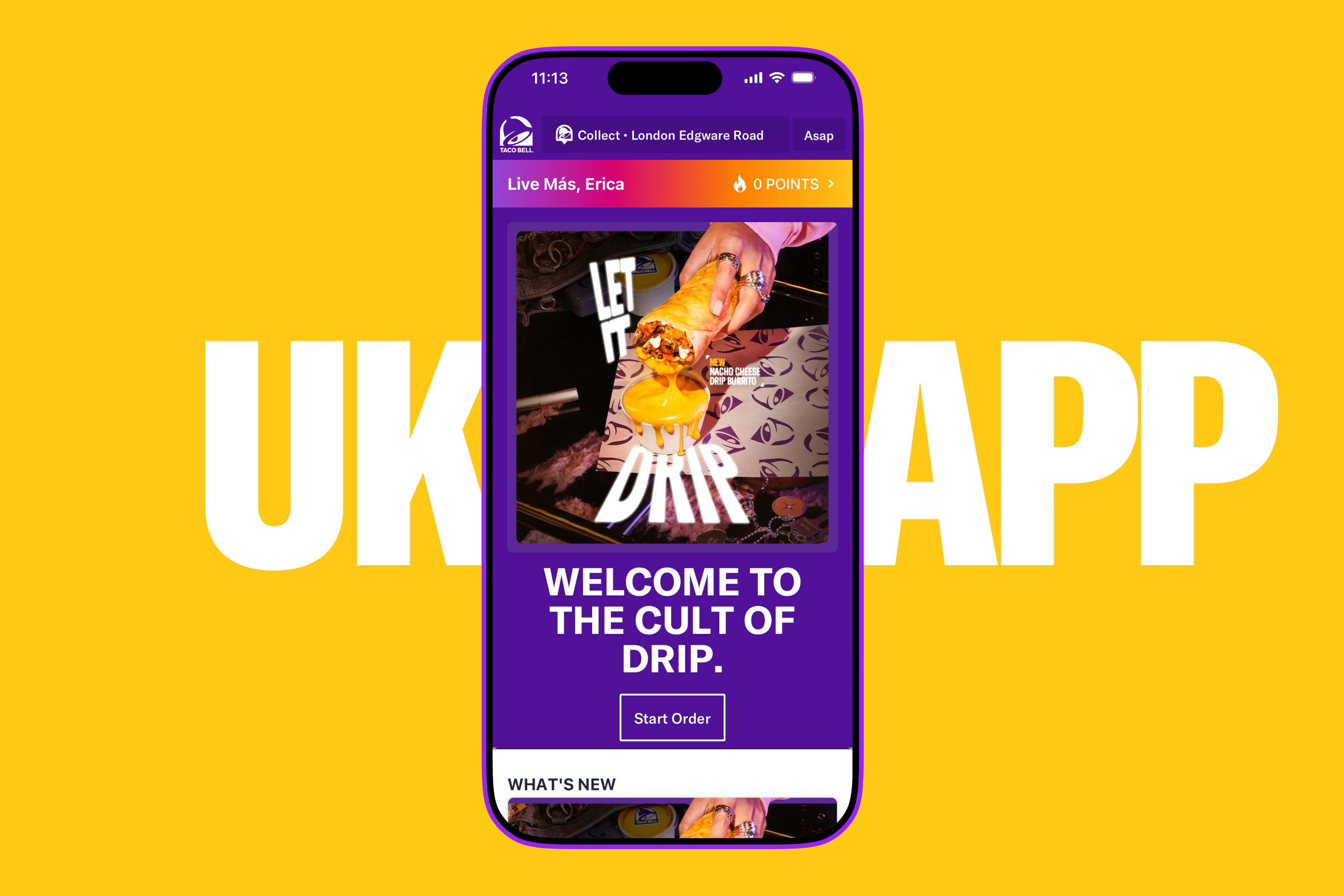
No single decision created the problem. Years of independent choices across Taco Bell's US and UK websites, mobile apps, teams, and design systems had gradually pulled the experiences in different directions.
A slightly different component here. A new spacing value there. Different typography, colors, interactions, and patterns solving similar problems.
Individually, the differences felt small. Together, they had become a systems problem.
We turned fragmentation into a roadmap.
The final audit gave our client partners something they hadn't previously had: a holistic view of how Taco Bell's design ecosystem existed across markets, platforms, journeys, and systems.
What began as hundreds of screens and thousands of disconnected component decisions became a documented framework showing what aligned, what had drifted, what could be reused, and what needed to evolve.
The deliverable wasn't simply an inventory. It was a path forward.
A shared source of truth gave design and development teams greater clarity around how the systems could converge while still preserving the flexibility Taco Bell needed to evolve across products and markets.
Finally, all updates were integrated into Token Studio and Storybook.
The Audit
We needed to understand before unifying.
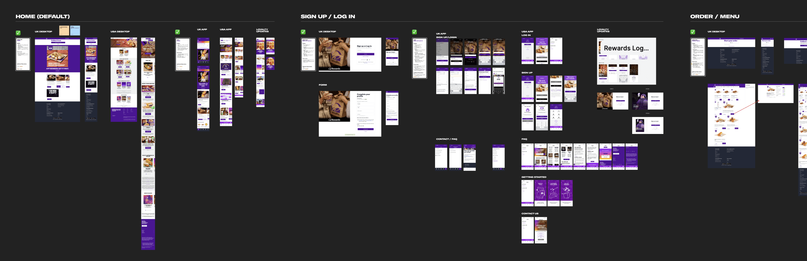
Rather than starting with components in isolation, we organized the audit around the experiences customers actually moved through.
Sign Up. Loyalty. Menu. Cart. Checkout.
Looking at these core journeys side by side across US and UK websites and mobile applications allowed us to see where experiences aligned, where they had diverged, and where entirely different solutions had emerged for the same customer need.
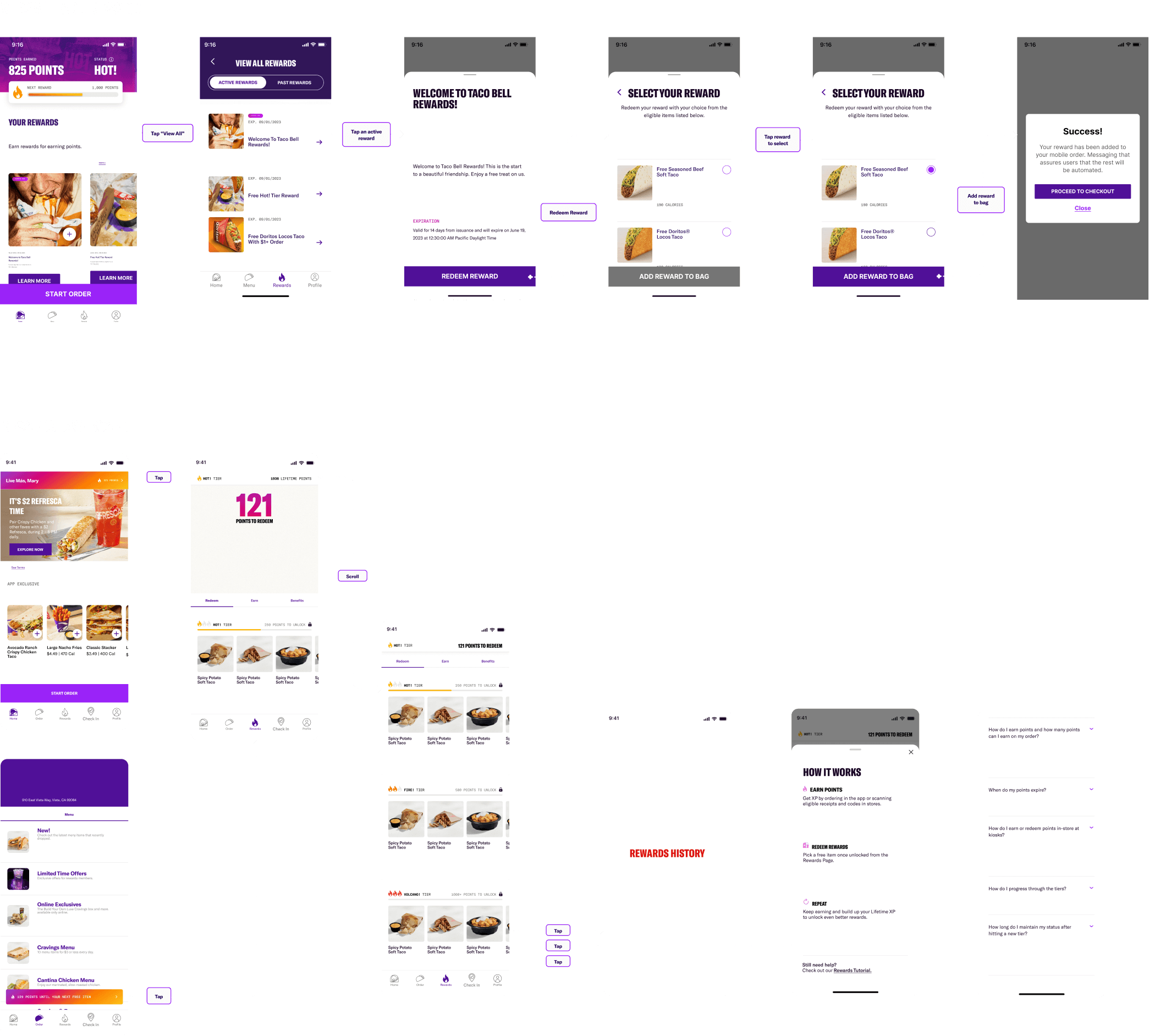
The audit became less about cataloging screens and more about tracing the decisions that had shaped them.
Compare "like with like".
Organizing the work around shared customer journeys gave us a consistent lens for comparing different markets and platforms.Find the recurring patterns.
Looking across complete experiences revealed which differences were isolated and which represented larger systemic inconsistencies.Understand before changing.
Rather than assuming every variation was wrong, we first worked to understand why it existed and whether it still served a meaningful purpose.
creative team
Design System Lead: Erica Gallo
Senior Product Designers: Shea Michals & Francisco Lauge

Going Atomic
The details revealed where the systems diverged.
Once the journeys were mapped, we moved deeper.
Each experience was broken down through an atomic lens, examining the atoms, molecules, and organisms that made up the larger product ecosystem.
Typography. Color. Spacing. Border radius. Buttons. Inputs. Cards. Navigation. Interaction patterns.
This level of detail allowed us to move beyond saying two screens "felt different" and identify the individual decisions creating that difference.
Some patterns already aligned.
Shared solutions gave us a foundation we could preserve rather than redesign.Some had simply drifted.
Small visual and behavioral differences had accumulated without providing meaningful differentiation.Others were intentionally unique.
Not every difference needed to disappear. Some patterns existed because of legitimate platform, market, or brand needs.

The Realization
Consistency wasn't cosmetic. It was operational.
The deeper we went, the clearer it became that visual inconsistency was only the surface-level symptom.
Multiple solutions to the same problem meant designers had more decisions to make, developers had more patterns to maintain, and every new feature carried the potential to introduce even more variation.
The design system wasn't just responsible for visual consistency. It needed to make the organization more consistent in how it designed, built, and evolved products.
For customers:
One Taco Bell should feel familiar regardless of where or how someone experiences it.For designers:
Shared patterns reduce repeated decisions and allow teams to focus their energy on solving new problems.For development:
A trusted component foundation creates greater confidence that existing solutions can be reused rather than rebuilt.


Our Framework: Every discrepancy became a design decision.
Finding inconsistencies was only useful if we could determine what should happen next.
Once the component inventory was documented, we mapped the ecosystem against Yum!'s Helium Design System. Instead of treating Helium as a library to blindly migrate toward, it became a benchmark for evaluating every pattern we uncovered.
For each component, we could begin asking:
Does this already exist?
Can an existing component solve the need?
Should Taco Bell's implementation remain unique?
Does the shared component need to evolve?
Or does the ecosystem genuinely need something new?
The audit transformed subjective differences into explicit design decisions.
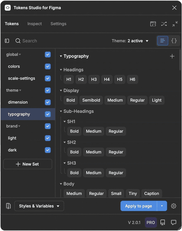
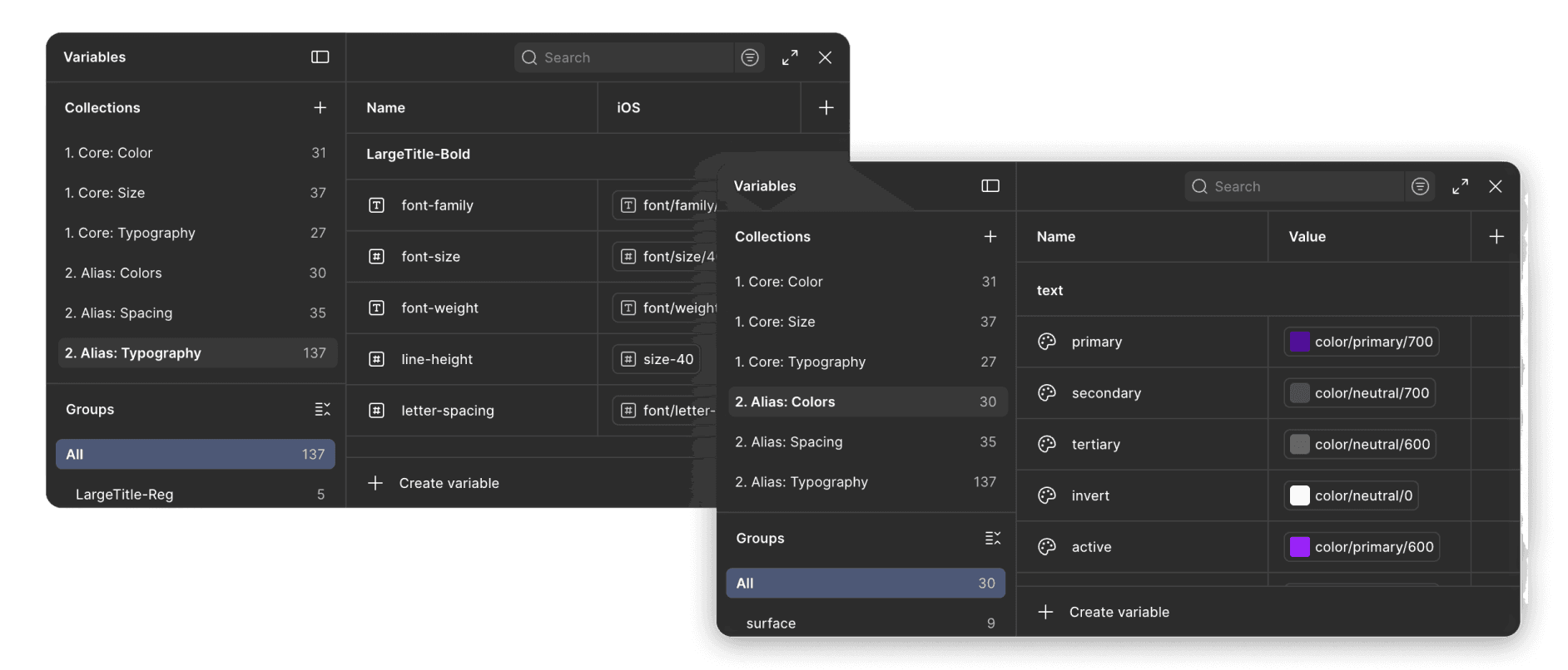
Three systems needed one shared foundation.
The goal wasn't to force every experience into perfect uniformity.
It was to establish where consistency created value and where flexibility was necessary.
Rather than simply correcting individual components, the work created a clearer path for bringing Taco Bell's standalone design language into closer alignment with Yum!'s broader Helium ecosystem.
That meant designing less, not more.
Reuse what already worked.
Existing shared patterns became opportunities to eliminate unnecessary duplication.Evolve what needed flexibility.
Where Taco Bell introduced legitimate product or brand requirements, the system needed enough flexibility to accommodate them.Create only when necessary.
Net-new components became intentional additions rather than another source of fragmentation.
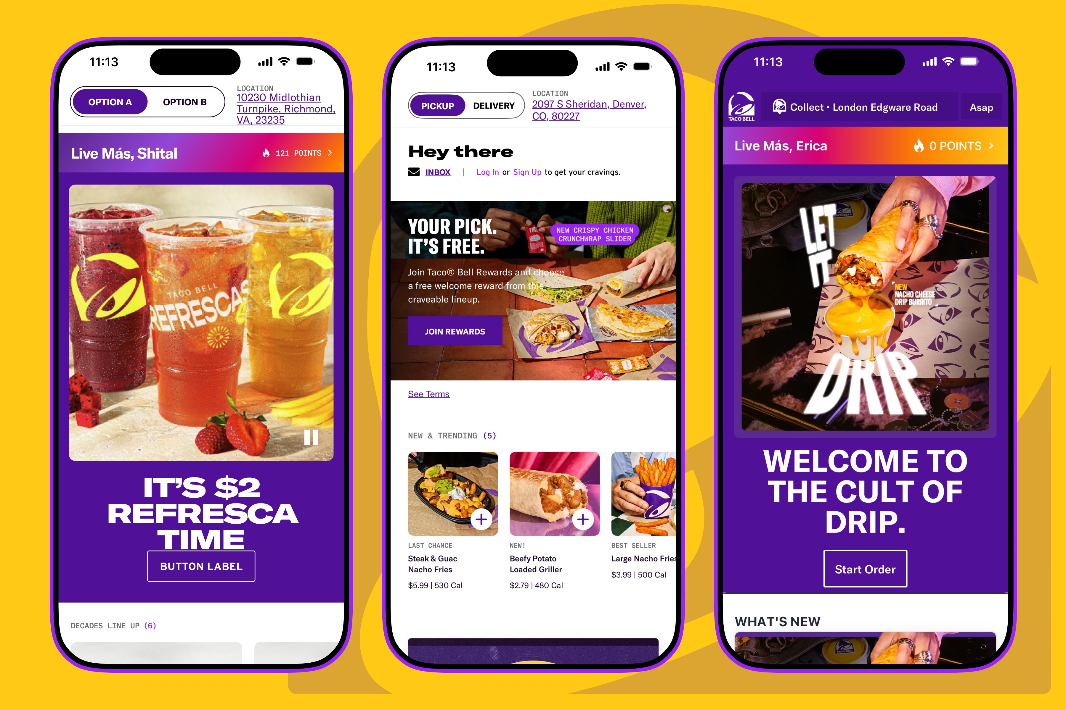
Due to the confidential nature of the internal design systems, I’m limited in what I can publicly share, but the work unanimously gave our client partners their first clear view into the full scale perspective of their design libraries, ultimately helping align teams around a more unified direction for their global presence.
Dive into more design systems
While I can't show everything here, you can unpack and explore my larger design system expertise for Pelican.
→ Pelican Cases